
Academic Project for Universitat Politècnica de Catalunya

You are looking at an academic project based on the graphic design of a magazine based on a briefing.
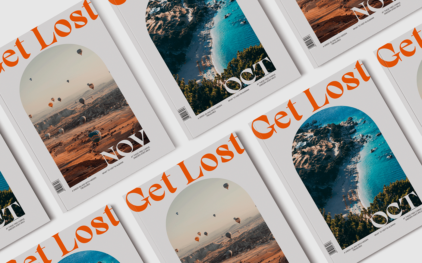
In this case we are talking about Get Lost, a magazine launched by an eponymous travel company with the aim of both promoting itself and inspiring readers to travel.
Get Lost is for anyone who is tired of the typical overcrowded holiday destinations and wants to embark on new adventures and discover unknown cultures.

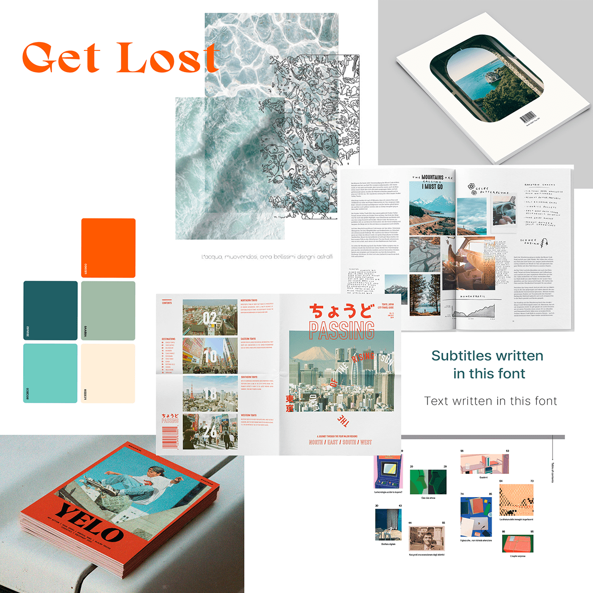
For the logo and titles we used the Gavency typeface, as it is a bold serof, with a lot of personality. Conveying uniqueness and attracting the attention of the young audiences.
For both the text and some of the subtitileswe have choosen to use the Inter Tight typeface as it is a neo-grotesque sans serif that has a good legibility, offering us a lighter version as well.
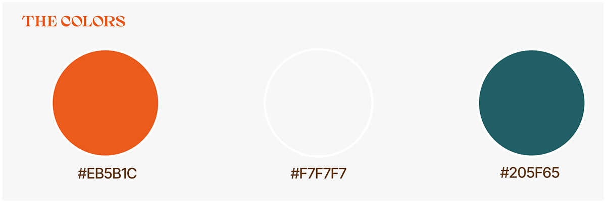
Orange is the colour of the logo. It provides contrast, giving us a point of vitality and energy. This tone makes apology to the curious and adventurous public to which we address.
Beige is also used, to transmit naturalness and proximity.
The third colour is dark turquoise blue, suggesting a point of tranquillity and confidence.


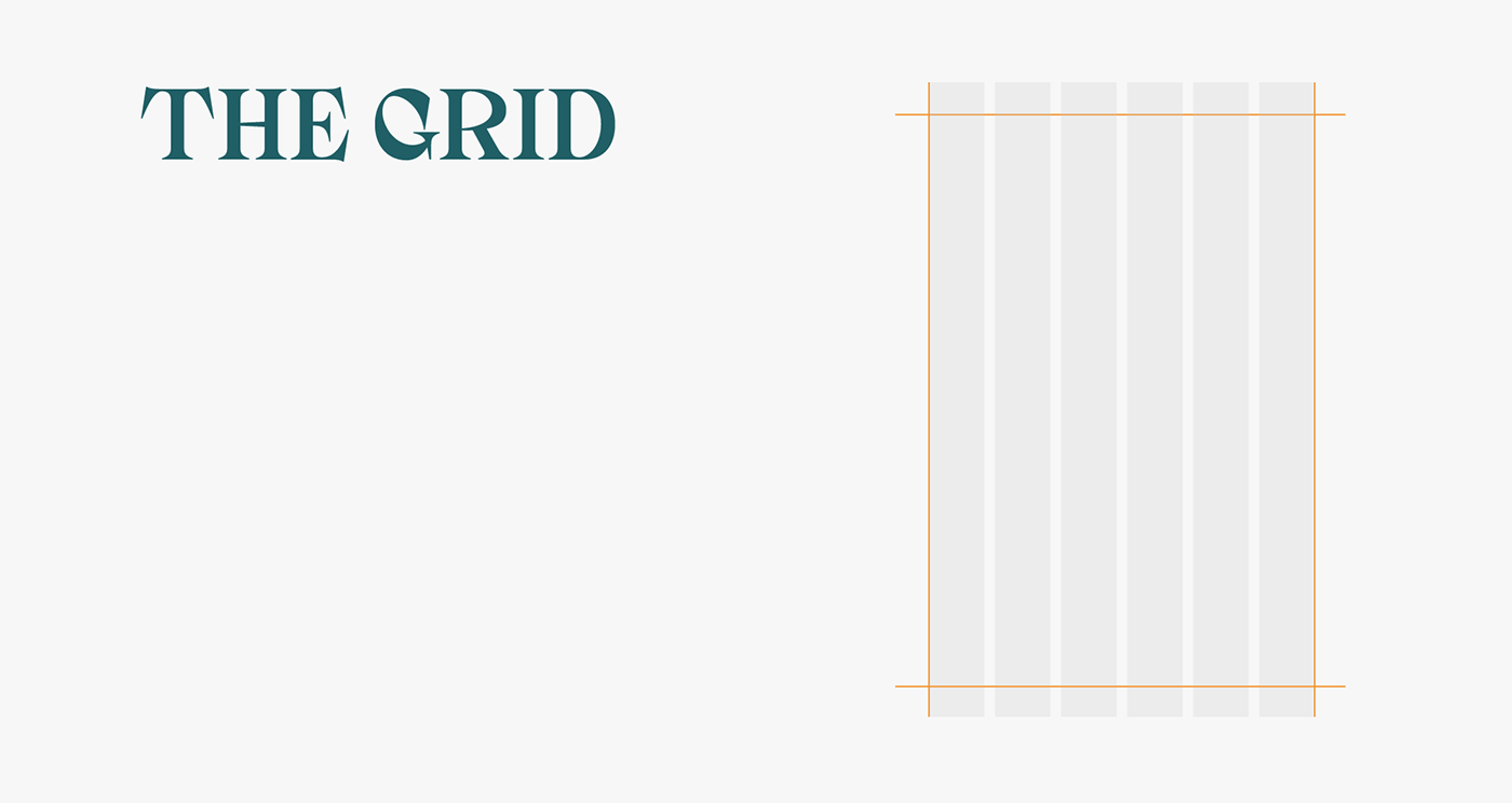
We have used a grid of 6 columns from which different compositions have been elaborated.


All images used are taken from Unsplash except those specified.
Texts have been extracted from National Geographic and Touropia.
Texts have been extracted from National Geographic and Touropia.
